Description
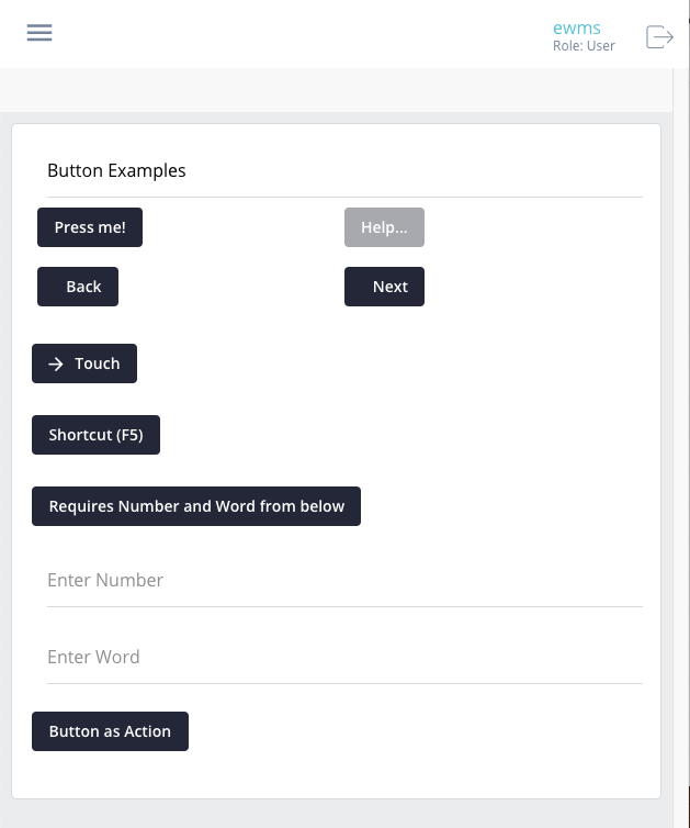
The Button widget also called an Action; is a control widget. When this widget is pressed by the user, the current screen will be submitted to the server for validation and flow control. Additionally, when the screen/form is submitted, there will be an “action” appended to the payload that is sent to the server – this will allow you to handle the action in the outgoing/action of the Flow XSL.
Component Attributes
| Name | Default | Required (Y/N) | Extra |
|---|---|---|---|
| name | Y | The name attribute needs to be unique for each component. When a submit comes from the UI, an action is made available in Form and Flow XSL files via outgoing context. name is the value of the action. | |
| type | function | Y | “function” or “button” are valid values. |
| title | N | Label for the widget. Setting the value to “hidden” has the same result as leaving it empty. Main text of the button. | |
| group | N | Assigns a logical grouping to a single multiple components that allow them to be resized using reactive breakpoints. This is required for colSize to work. | |
| colSize | N | Comma separated string of reactive breakpoints and the number of grid spaces acquired by the widget. group must be present in order for this to work. e.g. “col-12, col-sm-8, col-md-6, col-lg-4, col-xl-3” | |
| color | primary | N | String or hex value of color to set as the background. |
| icon | N | String name of an icon from the Ionic Icons v3 collection. e.g. “md-add”. Aligns to the left side of the button title. | |
| audioText | N | Only available for mobile builds of the UI (Android or iOS). When the widget gains focus, the value of this attribute will be spoken from the device to the user. Requires Text-To-Speech (TTS) enabled in the user settings. Focus is gained on mouseover of buttons. | |
| submit | N | Enables the button to submit the Form to the Server. This value becomes true is the type is set to “function” or if the button is defined using <action />. | |
| shortcutKey | N | Allows the user to trigger the button press without tapping the button, instead, by pressing the specified shortcutKey combination. Any length shortcut is supported. When multiple keys must be pressed at the same time, indicate this by separating the keys with a “+” symbol. | |
| disabled | N | Cause it to become unresponsive to user input – “greyed out”. This can be used to control when the user is able to trigger the associated action. | |
| requires | N | Before the Button is allowed to submit the current form, it will first check for any properties on the form that are required before it can be sent. In the example below, the widgets named “firstname” and “lastname” would need to have a value (not null) before the button will submit. Note: You could simply set required on the other properties, but, this validation takes place on the client; where the validation for the required attribute takes place on the server. |
Code Examples
<property
  name="basicButton"
  title="Press me!"
  type="function"
  section="Button Examples"
  group="buttons"
  colSize="col-12, col-sm-6, col-md-3" />

<action
  name="actionButton"
  title="Press me!"
  section="Button Examples"
  group="buttons"
  colSize="col-12, col-sm-6, col-md-3" />

<property
  name="buttonButton"
  title="Press me!"
  type="button"
  section="Button Examples"
  group="buttons"
  colSize="col-12, col-sm-6, col-md-3" />
<!-- Requires buttonNum and buttonStr before it will become active -->
<property
  name="requiresButton"
  title="Requires Number and Word from below"
  type="function"
  requires="buttonNum, buttonStr" />

<!-- Uses ShortcutKeys and has a color -->
<property
  name="shortcutButton"
  title="Shortcut (ctrl+a)"
  group="test1"
  color="cornflowerblue"
  type="function"
  shortcutKey="CTRL+a"
  submit="true"/>