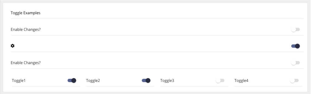
The Toggle widget is a basic widget that allows for simple Boolean data to be collected from a user. This data can be used as-is (yes/no) or it can be used within the Form definition to control conditional logic on the user interface to show/hide/ other widgets.
Component Attributes
| Name | Default | Required (Y/N) | Extra |
|---|---|---|---|
| name | Y | The name attribute needs to be unique for each component. When a submit comes from the UI, an action is made available in Form and Flow XSL files via outgoing context. name is the value of the action. | |
| type | Y | “boolean” is the only valid value. | |
| title | N | Label for the widget. Setting the value to “hidden” has the same result as leaving it empty. This text appears above the options. | |
| group | N | Assigns a logical grouping to a single multiple components that allow them to be resized using reactive breakpoints. This is required for colSize to work. | |
| colSize | col-12 | N | Comma separated string of reactive breakpoints and the number of grid spaces acquired by the widget. group must be present in order for this to work. e.g. “col-12, col-sm-8, col-md-6, col-lg-4, col-xl-3” |
| icon | N | String name of an icon from the Ionic Icons v3 collection. e.g. “md-add”. Aligns to the left side of the button title. | |
| disabled | false | N | Cause it to become unresponsive to user input – “greyed out”. This can be used to control when the user is able to trigger the associated action. |
| submit | false | N | Enables the component to submit the Form to the Server. This value becomes true is the type is set to “function” or if the button is defined using <action />. This is triggered when the user interacts with the component. |
| required | false | N | Indicates whether a value is required in order to progress. Can be checked on the client or server side. Adds an asterisk to the label. |
Code Examples
<property
  name="toggleDisabled"
  title="Open the hatch?"
  type="boolean"
  disabled="true" />

<property
  name="showMore1"
  title="Show More..."
  submit="true"
  group="showExtraThings"
  colSize="col-12, col-sm-6, col-md-3, offset-md-3"
  type="boolean" />

<property
  name="showSettings"
  icon="cog"
  submit="true"
  group="showExtraThings"
  colSize="col-12, col-sm-6, col-md-3, offset-md-6"
  type="boolean" />