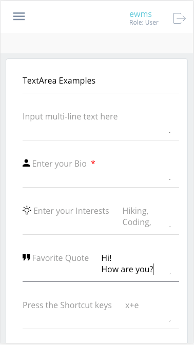
The text-area widget is used to collect textual multi-line (string) data in the Elastic-UI. Inputs can be customized through the addition of attribute definitions, logical groupings, and reactive layouts. The available configurations for this widget are similar to that of the Input widget, with the exception of some of the advanced validation techniques such as equalTo, greaterThanEqualTo, etc…
Component Attributes
| Name | Default | Required (Y/N) | Extra |
|---|---|---|---|
| name | Y | The name attribute needs to be unique for each component. When a submit comes from the UI, an action is made available in Form and Flow XSL files via outgoing context. name is the value of the action. | |
| type | Y | “textarea” is the only valid value. | |
| title | N | Label for the widget. Setting the value to “hidden” has the same result as leaving it empty. This text appears above the options. | |
| group | N | Assigns a logical grouping to a single multiple components that allow them to be resized using reactive breakpoints. This is required for colSize to work. | |
| colSize | col-12 | N | Comma separated string of reactive breakpoints and the number of grid spaces acquired by the widget. group must be present in order for this to work. e.g. “col-12, col-sm-8, col-md-6, col-lg-4, col-xl-3” |
| icon | N | String name of an icon from the Ionic Icons v3 collection. e.g. “md-add”. Aligns to the left side of the button title. | |
| readOnly | N | Boolean. Displays the widget, but, does not allow user input. If there is an placeholder value or previously bound value, it will remain, immutable. | |
| placeholder | N | String. Text to display to the user until they select the component and enter a value. Can use as a hint. | |
| minLength | N | Sets the smallest number of characters or digits allowed in the widget. If there are fewer characters inside the focused widget, an error message is displayed beneath the input. | |
| maxLength | N | Limits the number of characters or digits that can be entered into the widget. The widget will not allow the user to enter more than the number specified. | |
| pattern | N | Specify a regular expression (REGEX) that the input must follow. When this pattern is not followed by the user, an error message will appear under the input widget. | |
| after | N | Takes a single value, which is the name of another property. An error will be displayed if you try to submit the form without entering a value into the widget which must be filled before this one. A good example is an email or password verification form; the widget will only be available after the mentioned component has a value | |
| audioText | N | Only available for mobile builds of the UI (Android or iOS). When the widget gains focus, the value of this attribute will be spoken from the device to the user. Requires Text-To-Speech (TTS) enabled in the user settings. | |
| audioLocale | en-us | N | The locale as a hint for the audioText. This will change the vocal pattern of the voice reading the audioText. “en-us”, “en-uk”, etc… |
Code Examples
<property
  name="basicTextArea"
  title="Enter Summary of work"
  type="textarea" />

<property
  name="reactiveArea1"
  group="r1"
  colSize="col-12, col-sm-6"
  title="Tell me about yourself"
  type="textarea" />

<property
  name="reactiveArea2"
  group="r1"
  colSize="col-12, col-sm-6"
  title="How was your weekend?"
  type="textarea" />
<property
  name="advancedTextArea"
  title="Describe a time when you accomplished a goal as part of a team"
  placeholder="Enter Text Here...(min 40 max 500)"
  minLength="40"
  maxLength="500"
  type="textarea" />

<property
  name="advancedReactiveArea1"
  group="r2"
  colSize="col-12, col-sm-6"
  title="Tell me about yourself"
  placeholder="I would describe myself as..."
  type="textarea" />

<property
  name="advancedReactiveArea2"
  group="r2"
  audioText="Tell me, how was your weekend?"
  audioLocale="en-us"
  after="advancedRactiveArea1"
  colSize="col-12, col-sm-6"
  title="How was your weekend?"
  type="textarea" />