The Select widget also called the “combo box” widget, is used to collect user data from a list or enumeration of potential options. Combo Box can be configured to retrieve either a single response or multiple responses from the user using a single attribute.
If you wish to avoid using a modal/popover, consider using the Checkbox and Radio Components.
Component Attributes
| Name | Default | Required (Y/N) | Extra |
|---|---|---|---|
| name | The name attribute needs to be unique for each component. When a submit comes from the UI, an action is made available in Form and Flow XSL files via outgoing context. name is the value of the action. | ||
| type | “enum” is the only valid value. | ||
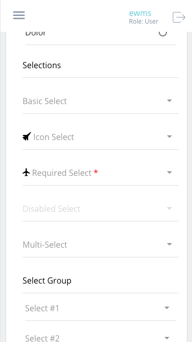
| title | Label for the widget. Setting the value to “hidden” has the same result as leaving it empty. This text appears above the options. | ||
| group | Assigns a logical grouping to a single multiple components that allow them to be resized using reactive breakpoints. This is required for colSize to work. | ||
| colSize | col-12 | Comma separated string of reactive breakpoints and the number of grid spaces acquired by the widget. group must be present in order for this to work. e.g. “col-12, col-sm-8, col-md-6, col-lg-4, col-xl-3” | |
| enum | Comma-separated values that represent the value associated with the option the user picks. The order of enum is very important. Make sure that the index of enum and enumTitles match when necessary. When the form is submitted, the selected enum value will be sent in the body of the request. | ||
| enumTitles | Comma-separated strings that represent the label for each of the enum values listed. Match the index of enum and enumTitles so that enumTitles[0] corresponds to enum[0]. | ||
| icon | String name of an icon from the Ionic Icons v3 collection. e.g. “md-add”. Aligns to the left side of the button title. | ||
| disabled | false | Cause it to become unresponsive to user input – “greyed out”. This can be used to control when the user is able to trigger the associated action. | |
| submit | false | Enables the component to submit the Form to the Server. This value becomes true is the type is set to “function” or if the button is defined using <action />. This is triggered when the user interacts with the component. | |
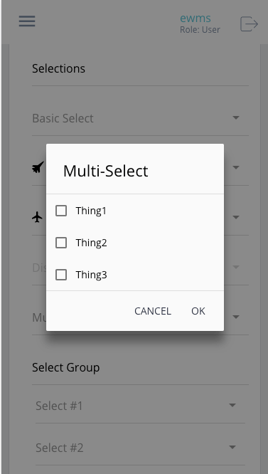
| multiple | false | Boolean. Indicates whether the modal should allow for a single user input or multiple. Radio vs Checkbox within the popup. |
Code Examples
<property
  name="sampleEnum"
  multiple="true"
  title="XoR"
  type="enum"
  enum="y, n, b"
  enumTitles="Yes, No, Both"
/>