Description
The input widget is used to collect textual (string) and numeric (number) data in the Elastic-UI. Inputs can be customized with a set of optional attributes in the XSLT. Logical groupings, component behavior, and reactive layouts can all be manipulated.
Component Attributes
| Name | Default | Required (Y/N) | Extra |
|---|---|---|---|
| name | Y | The name attribute needs to be unique for each component. When values are returned from the user, the data will be stored in a key-value-pair and made available in Form and Flow XSL files via outgoing context. | |
| type | Y | “string” or “number” are valid values. | |
| title | N | Label for the widget. Setting the value to “hidden” has the same result as leaving it empty. | |
| group | N | Assigns a logical grouping to a single multiple components that allow them to be resized using reactive breakpoints. This is required for colSize to work. | |
| colSize | col-12 | N | Comma separated string of reactive breakpoints and the number of grid spaces acquired by the widget. group must be present in order for this to work. e.g. “col-12, col-sm-8, col-md-6, col-lg-4, col-xl-3” |
| icon | N | String name of an icon from the Ionic Icons v3 collection. e.g. “md-add” | |
| submit | N | Boolean that indicates whether or not the current form should be submitted to the server/engine. Often used to submit data entered by a user. When a component submits, there will be a corresponding action present in the outgoing flow context with the value of the name attribute. e.g. outgoing/action=”myComponent” | |
| required | N | Indicates whether a value is required in order to progress. Can be checked on the client or server side. Adds an asterisk to the label | |
| minLength | N | Sets the smallest number of characters or digits allowed in the widget. If there are fewer characters inside the focused widget, an error message is displayed beneath the input. | |
| maxLength | N | Limits the number of characters or digits that can be entered into the widget. The widget will not allow the user to enter more than the number specified. | |
| audioText | N | Only available for mobile builds of the UI (Android or iOS). When the widget gains focus, the value of this attribute will be spoken from the device to the user. Requires Text-To-Speech (TTS) enabled in the user settings. | |
| pattern | N | Specify a regular expression (REGEX) that the input must follow. When this pattern is not followed by the user, an error message will appear under the input widget. | |
| readOnly | false | N | Disables the ability for users to manipulate the data displayed by this widget. |
| placeholder | N | Display some text inside of the input area of the widget. When the user enters data, this text is overwritten. Used to provide user hints. | |
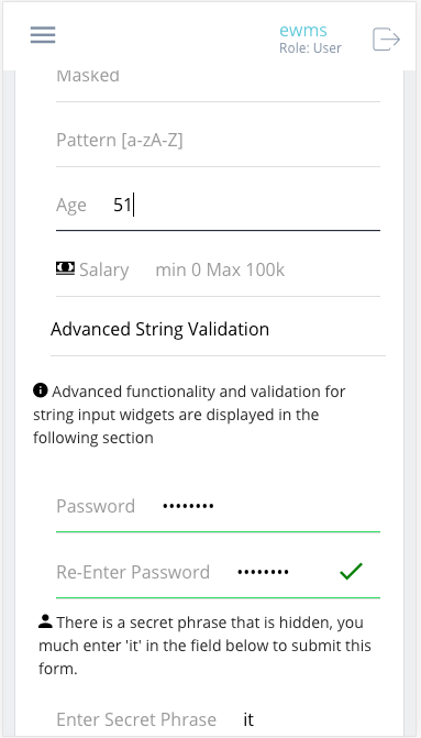
| masked | false | N | When set to “true”, causes the user values of an input widget to be represented as a series of ellipse. THIS DOES NOT ENCRYPT THE DATA! The value of the widget is still collected, validated, and transported as plain-text. This attribute is simply designed to obscure human vision of an input value. |
| matchValue | N | Takes a single value, which is the name of another property. It compares the value of the current widget to the value of the widget for which the match has been indicated. A common example would be collecting an email address or password; where the form needs to validate that the values of the two widgets are the same. | |
| after | N | Takes a single value, which is the name of another property. An error will be displayed if you try to submit the form without entering a value into the widget which must be filled before this one. A good example is an email or password verification form; the widget will only be available after the mentioned component has a value | |
| clearInput | false | N | If true, a clear icon will appear in the input when there is a value. Clicking it clears the input. |
| clearOnEdit | false | N | If true, the value will be cleared after focus upon edit. |
| focus | false | N | Boolean that indicates whether this field should become focused automatically when the form renders. Only one focus can occur at a time. |
| shortcutKey | N | String that specifics the a quick way to interact with the component. For input fields this causes focus to occur. For buttons/actions this causes a submit to occur. e.g. “F1” or “ctrl+t” |
Value Comparison Attributes
| Name | Default | Required (Y/N) | Extra |
|---|---|---|---|
| compareValidation | false | N | Boolean that indicates whether or not a validation needs to be completed for this component. |
| greaterThan | N | Takes the name of another property and attempts to compare, returns boolean state of the validation and shows errorMessage when validation fails | |
| greaterThanEqualTo | N | Takes the name of another property and attempts to compare, returns boolean state of the validation and shows errorMessage when validation fails | |
| lessThan | N | Takes the name of another property and attempts to compare, returns boolean state of the validation and shows errorMessage when validation fails | |
| lessThanEqualTo | N | Takes the name of another property and attempts to compare, returns boolean state of the validation and shows errorMessage when validation fails | |
| equalTo | N | Takes the name of another property and attempts to compare, returns boolean state of the validation and shows errorMessage when validation fails | |
| errorMessage | N | Text to display in the case that any type of validation fails for this specific widget |
Code Examples
<property
  name="min"
  title="Enter Name"
  type="string"
  submit="true" />

<property
  name="max"
  title="Enter age"
  type="number"
  minLength="3" />

<property
  name="password"
  title="Password"
  type="string"
  masked="true"
  regex="[a-zA-Z]"
  minLength="3" />
<property
  name="passwordInput"
  title="Password"
  type="string"
  masked="true" />
<property
  name="passwordValidation"
  title="Re-Enter Password"
  type="string"
  masked="true"
  matchValue="passwordInput"
  after="passwordInput" />