Description
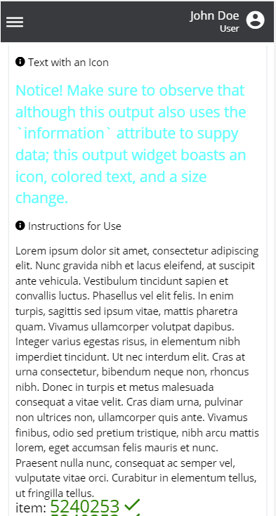
The output widget is used to display information to the user. Specifically, it is used to display plain-text messages. The output is commonly used to provide labels to groups of widgets and to provide additional information to users.
Many different configurations may be applied to the output; color, size, title, icon, and much more. Additionally, the data to display can be provided as static text via information or provided dynamically from the Flow via model reference.
Component Attributes
| Name | Default | Required (Y/N) | Extra |
|---|---|---|---|
| name | Y | The name attribute needs to be unique for each component. When values are returned from the user, the data will be stored in a key-value-pair and made available in Form and Flow XSL files via outgoing context. | |
| type | Y | “output” is the only valid value | |
| title | N | Label for the widget. Setting the value to “hidden” has the same result as leaving it empty. | |
| group | N | Assigns a logical grouping to a single multiple components that allow them to be resized using reactive breakpoints. This is required for colSize to work. | |
| colSize | col-12 | N | Comma separated string of reactive breakpoints and the number of grid spaces acquired by the widget. group must be present in order for this to work. e.g. “col-12, col-sm-8, col-md-6, col-lg-4, col-xl-3” |
| hidden | N | Boolean. When true, the value will still be assigned, but, the HTML element will not be rendered. Useful for storing invisible values or metadata within a Form. | |
| information | N | String of static text to show the user. | |
| model | N | String reference to an XML element created within the Form or Flow XSL files. The text value of this element will be used as the text. | |
| inline | false | N | Boolean. When true, the title and text will occupy the same line |
| fWeight | N | font-weight of the model or information | |
| titlefWeight | N | font-weight of the title text. “bold” | |
| icon | N | String name of an icon from the Ionic Icons v3 collection. e.g. “md-add”. By default the icon is to the left of the output title | |
| trailingIcon | N | String name of an icon from the Ionic Icons v3 collection. e.g. “md-add”. This icon will be added to the end of the output text. | |
| iconColor | black | N | String or hex value of color to set as the icon color. |
| iconSize | N | Pixel value. The text size of the icon. Applies to both regular icon and trailingIcon | |
| titleTextColor | N | String or hex value of color to set as the color of the title text. | |
| textColor | N | String or hex value of color to set as the text color. | |
| fontSize | N | Pixel value. Size to set the text of output. | |
| titleFontSize | N | Pixel value. Size to set the title. | |
| fontFamily | ‘Open Sans’, Helvetica sans-serif | N | Customize the font-family of the output text. Not the title. |
| float | N | CSS attribute to control positioning |
Code Examples
<property
  type="output"
  name="basicOutput"
  information="Simple output component with static text" />

<!-- The next output will display the value of this element -->
<userInformation>This value can be set dynamically</userInformation>

<property
  type="output"
  name="modelOutput"
  icon="information-circle"
  model="userInformation" />

<!-- Simple customization of icon -->
<property
  type="output"
  inline="true"
  name="customOutput"
  trailingIcon="checkmark-circle"
  iconSize="28"
  iconColor="green" />
<property
  type="output"
  name="fancyOutput"
  information="Look at how fancy I am!"
  textColor="gold"
  title="hidden"
  fontSize="34"
  lineHeight="0"
  inline="true"
  icon="bowtie" />
<property
  type="output"
  name="resp1"
  title="Output #1"
  group="first"
  col-size="col-12, col-sm-6, col-md-6, col-lg-4, col-xl-3"
  information="Lorem ipsum dolor sit amet, consectetur adipiscing elit.
  Cras leo neque, placerat vitae elit vehicula, iaculis varius odio." />

<property
  type="output"
  name="resp2"
  title="Output #2"
  group="first"
  col-size="col-12, col-sm-6, col-md-6, col-lg-4, col-xl-3"
  information="Lorem ipsum dolor sit amet, consectetur adipiscing elit.
  Cras leo neque, placerat vitae elit vehicula, iaculis varius odio." />

<property
  type="output"
  name="resp3"
  title="Output #3"
  group="first"
  col-size="col-12, col-sm-6, col-md-6, col-lg-4, col-xl-3"
  information="Lorem ipsum dolor sit amet, consectetur adipiscing elit.
  Cras leo neque, placerat vitae elit vehicula, iaculis varius odio." />

<property
  type="output"
  name="resp4"
  title="Output #4"
  group="first"
  col-size="col-12, col-sm-6, col-md-6, col-lg-4, col-xl-3"
  information="Lorem ipsum dolor sit amet, consectetur adipiscing elit.
  Cras leo neque, placerat vitae elit vehicula, iaculis varius odio." />